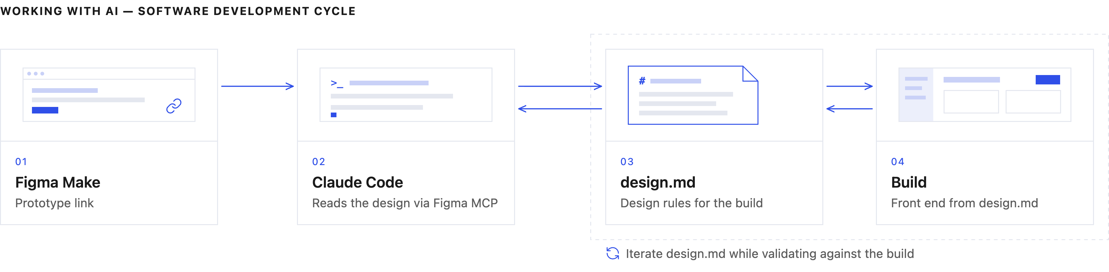
AI-assisted prototyping
Iteration 1: Early and quick concepts using figma make
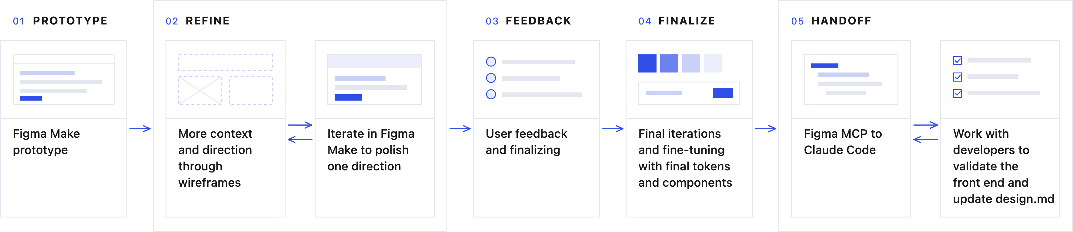
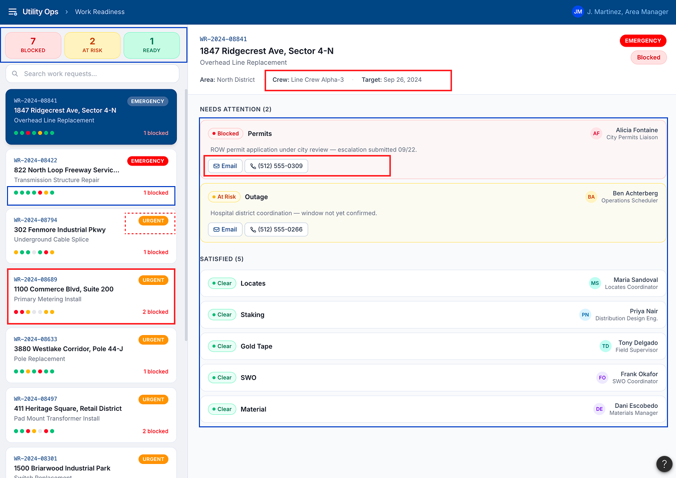
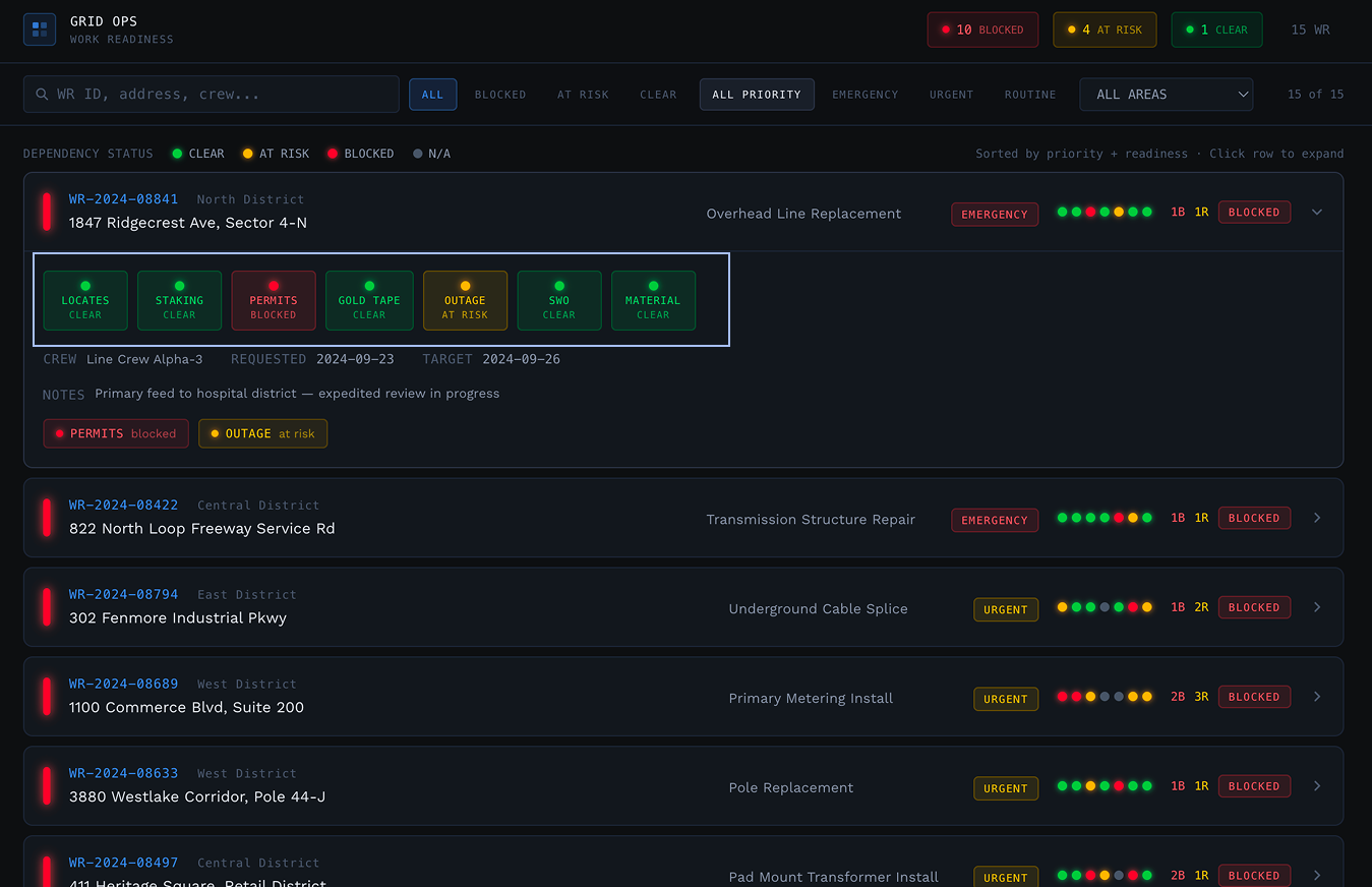
The fastest available route was to let the tooling try first. I used the existing chatbot to generate a prompt describing the problem and fed that into Figma Make. It returned two concepts, a dark operations console, and a lighter list-and-detail layout. Both worked. Neither was one these managers would use: each solved the brief generically, without the density or the patterns their day actually runs on.
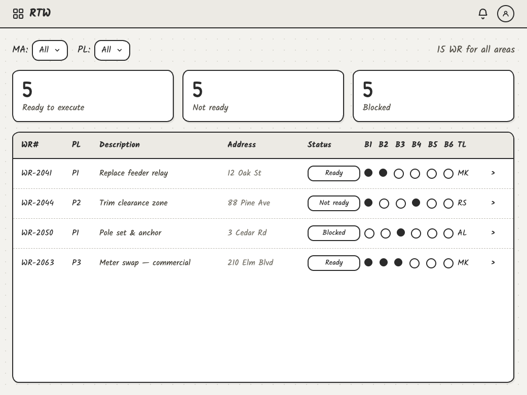
The list-and-detail concept, marked up. Blue for what I took forward, red for what needed rethinking. Recreated for this case study; the original work is under NDA.
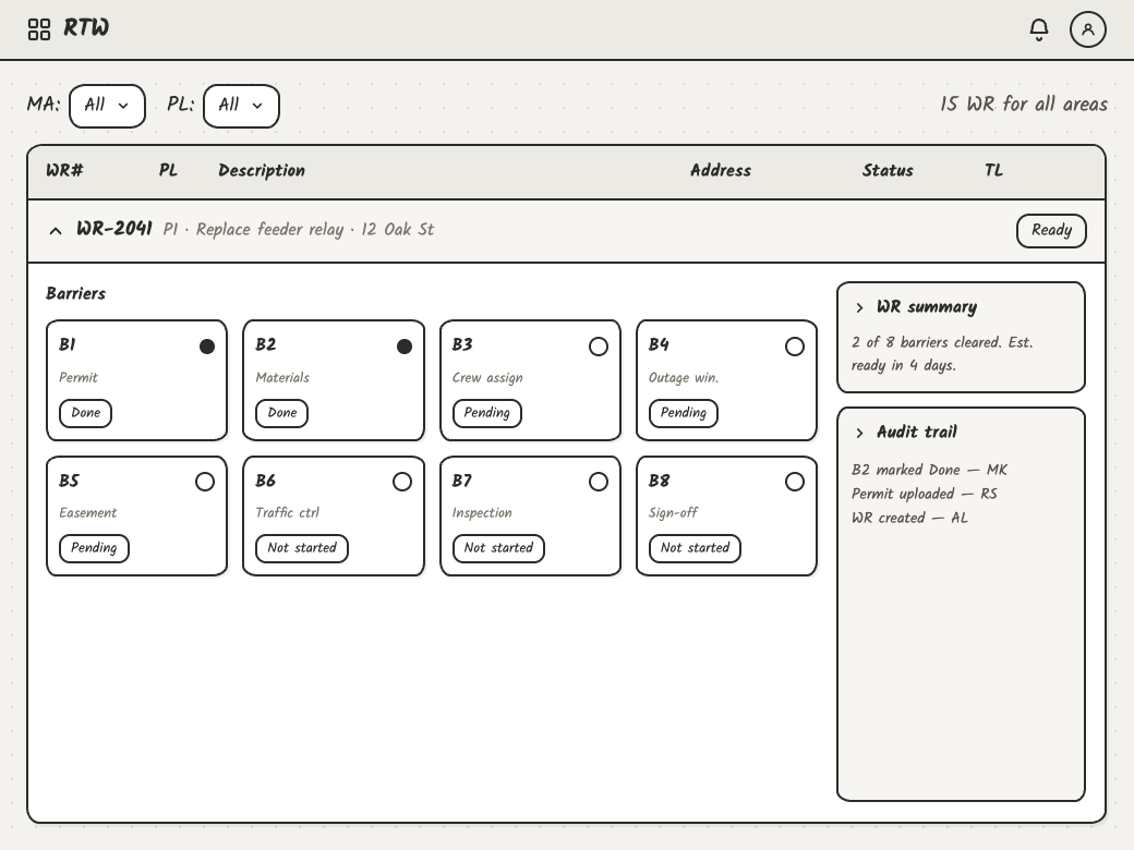
The operations console concept, marked the same way.
Neither was close to shippable. Neither followed our colour or interface conventions, and neither read as enterprise software — one looked like a consumer task app, the other like a control-room monitor. But between them there was enough right to be worth arguing with.
Early user feedback
Users mentioned it works as a concept, however they were feeling overwhelmed and suggested they do not want more work/task and an additional application with multiple steps, they showed a lot of other tools they use on a day to day basis whose interaction patterns they were already accostomed to:
- Data tables
- Reports and Excel sheets
- Power BI dashboards
- WMS and Salesforce applications
- Electric design products including SCADA and Design Manager
- Constant switching between Teams and Outlook to chase people
Other feedback on interaction and UI elements
- Multi-select on the filters, since managers rarely look at one status at a time
- Terminology changed to match how these teams actually speak
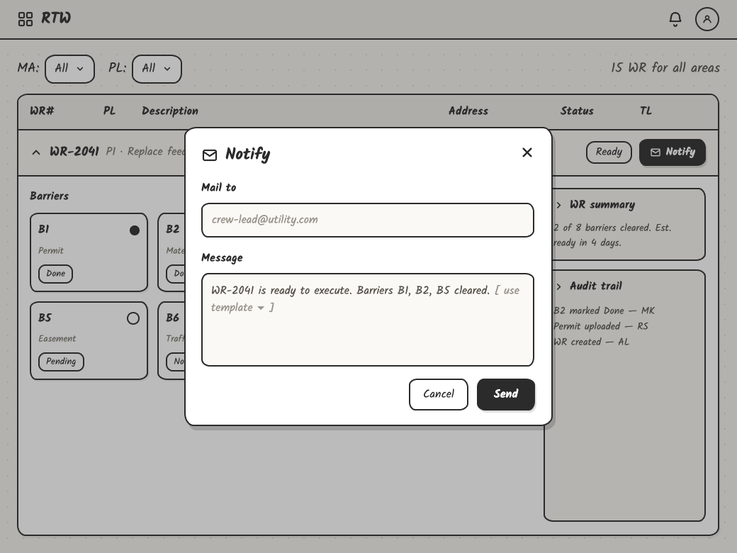
- An email notification template, so contacting an owner didn't mean composing from scratch
- Owners and teams made visible per data source, not just per work request
Feasibility in parallel
The technical team was kept in the loop throughout rather than consulted at the end, so feasibility concerns could surface while the design was still cheap to change. Their answer was that the data already existed, what it needed was APIs arranged to serve the view the users would agreed to.
Taken as inspiration
- A count of blocked, at risk and ready at the top of the view
- Dependencies as a status strip on every row, so readiness reads across items rather than one at a time
- Dependencies split into what needs attention and what is already satisfied
- A named owner against each dependency, not a team
ignored
- Cards where these teams expect a table — they spend their day in tables and spreadsheets
- Contacting an owner by phone or a mail client, which means leaving the view
- Priority competing with readiness for the same attention
- Crew and target dates given prominence, when neither decides whether work can start
- Nothing scoped to the management areas a manager actually covers
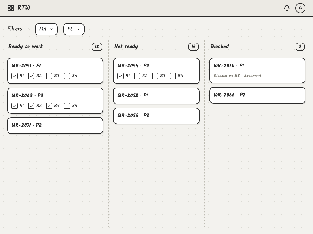
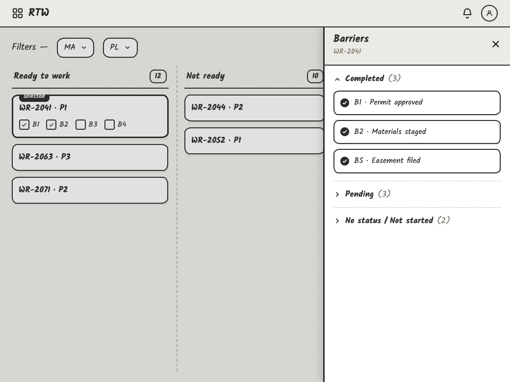
That was the point to stop prompting and start drawing. The concepts had given me a set of ideas worth keeping and a clearer sense of what was wrong, and the fastest way to hand that back was to wireframe it myself.
What the tool was missing was not capability but context. It had no idea what these managers look at all day. So I wireframed the structure myself, what sits at the top level, what expands in place, how a barrier names its owner, and what happens when you act on one.
Rather than discard the tool, I changed what I gave it. The second prompt carried the wireframes, the colour and type conventions of the systems these teams already work in, and references to the data tables and dashboards they use daily, the context the first attempt never had.
What the second direction got right
Re-prompting with the wireframes and the conventions of the tools these teams already use produced something structurally sound. It was a table, at the density managers work at, with dependencies as columns. Four things carried over from the research and stayed in the shipped product.
A table, not cards
Rows a manager can scan at the volume they actually carry, instead of tiles sized for seven items.
Dependencies as columns
Seven marks against each work request, so readiness reads across items rather than one at a time.
Scoped to management areas
The first thing a manager does is narrow to the areas they cover, including a colleague's when covering for them.
Notify from the row
Contacting the owner of a blocker without leaving the view, and leaving a record that the chase happened.
The structure held from here on. What it didn't settle was whether anything on the screen meant what it appeared to mean.
Iteration 2: Simplified yet detailed
A dense table that looks authoritative is a liability if its numbers don't hold up. The next stretch wasn't visual. It was deciding what each element actually claimed, and changing the ones that couldn't support the claim.
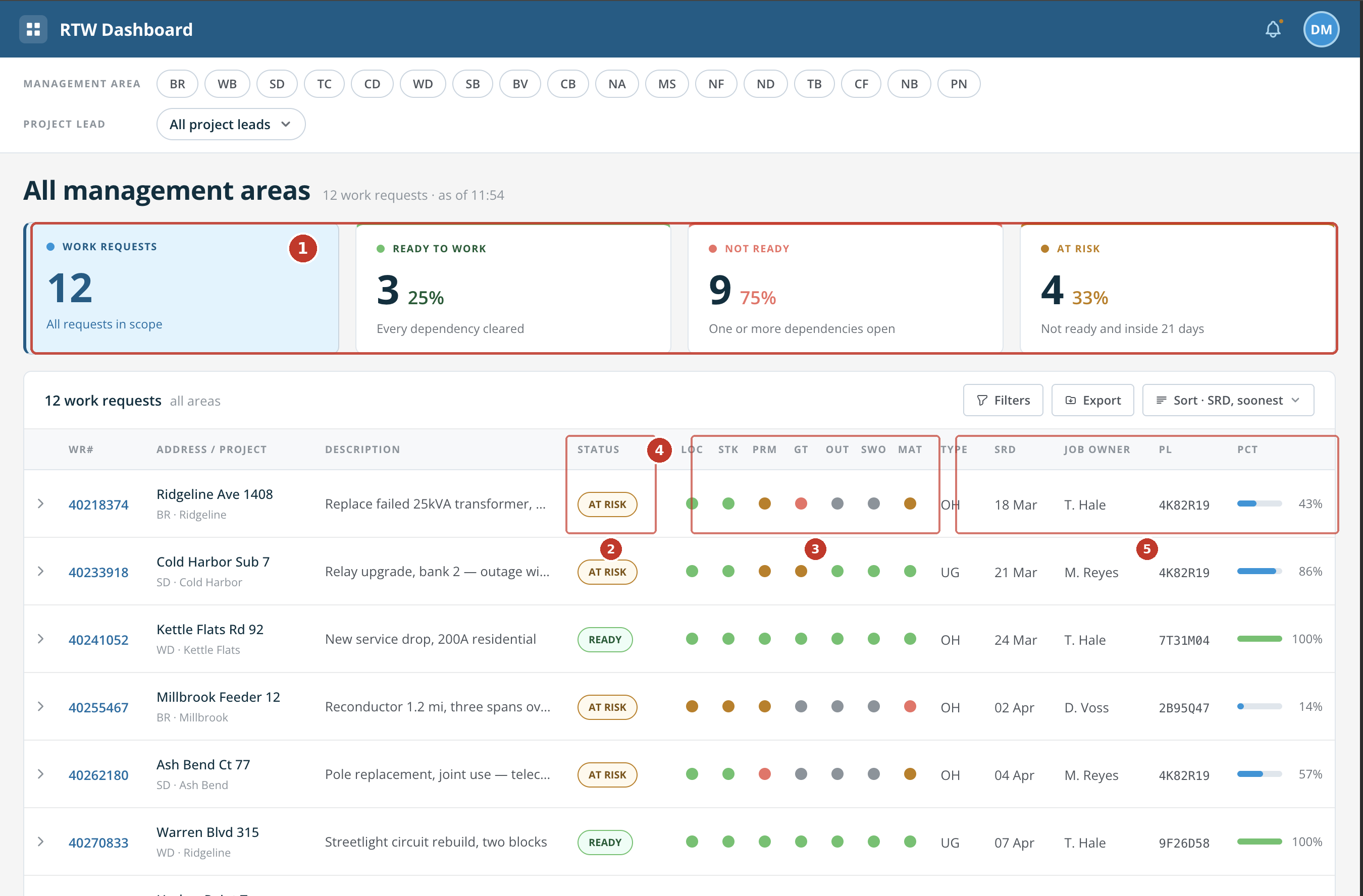
Second direction. Structure right, claims wrong.
#
Component
What changed
Why
1
Metrics
Four cards became three, percentages replaced with plain counts
A manager clicking “not ready” didn't get every not-ready job back, and three percentages against two denominators answered nothing anyone was asking. The numbers had to agree with the list beneath them.
2
At Risk
Dropped as a status value
At risk was a subset of not ready, but rendered as its rival. Urgency is a flag beside the status, not a replacement for it.
3
Dependency strip
Labelled, keyed, not-required state added
Seven coloured dots meant nothing to a manager covering an area they don't know. And a job needing no permit was never going to read as ready.
4
Status column
One status per work request
Two ideas shared a column — whether work could start, and how soon it was due. Readiness is the question being asked.
5
Table columns
Type, SRD, PL and the progress bar removed
None of them change what a manager does in the next hour, and the bar was worse than idle: a job reading 43% looked nearly halfway there while its permit sat unsubmitted for 28 days. They were taking the space the blocker needed.
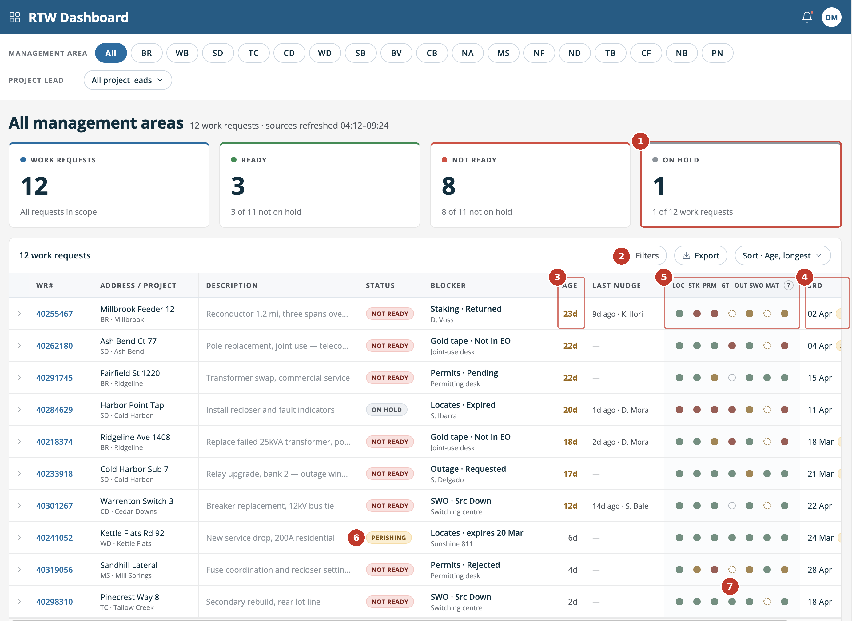
Next pass. The row now answers the question; three things on it still couldn't be trusted.
#
Component
What changed
Why
1
The row
Gained Blocker and Last Notified
What's holding the job, and who owns it, is the reason a manager opens this screen. Until now it sat behind a click.
2
Dependency strip
Moved beside Blocker, colours strengthened
The blocker names one thing; the dots show how much else is outstanding. Split apart, the row had to be read twice.
3
Metrics
On Hold folded into a subline
Held work isn't being chased. A card gave equal weight to the one thing a manager can't act on.
4
Status model
Perishing removed
Four values in a column three cards had to match. A job with everything cleared is ready.
5
Filters
Button removed
Two filters already sat at the top of the page. A button opening a near-empty panel teaches people not to press it.
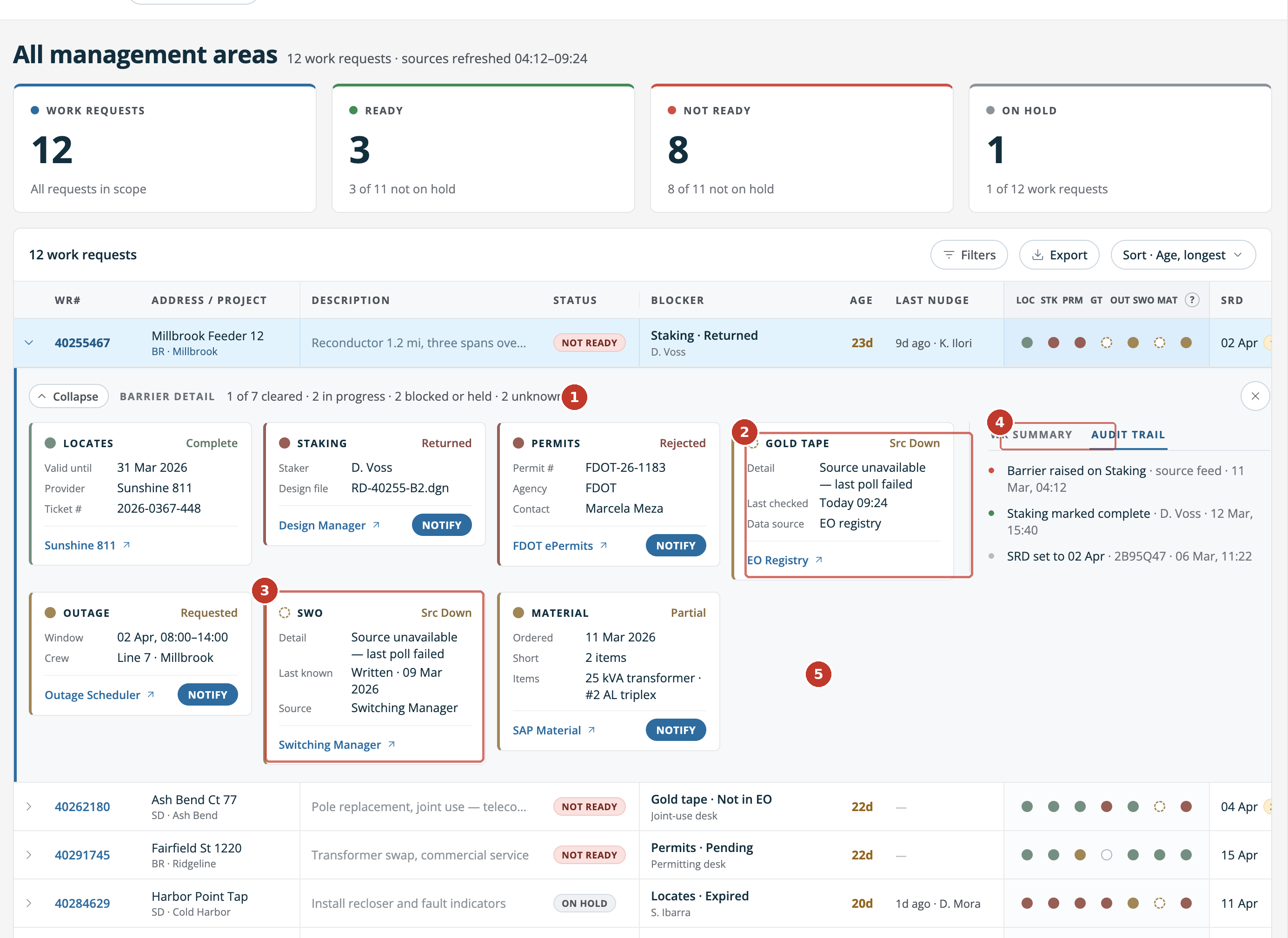
The same build, expanded.
#
Component
What changed
Why
1
Detail panel
Summary tab removed
Every field on it was already on the row above. The history was the only thing unavailable anywhere else, so it leads.
2
Card grid
Equal heights, fixed order, tightened fields
Seven dependencies in an order a manager can learn, instead of a grid that reshapes on every work request.
3
Notify
Only where a person can be reached
Gold tape updates itself from the registry. Offering to chase it implied someone was there to chase.
Refining the UI further
Three things were designed, built, and taken out. Two because the data couldn't support them, one because I'd read a status wrong.
Component
What it was for
Why it went
Idle tracking
A job can be not ready for a day or a month, and the difference decides what a manager chases first. The column showed days since anything last moved.
No source system records when a dependency changes state. The available dates are completion dates and poll timestamps, and neither produces an honest number.
Expiry warning
Some dependencies go stale. A locate that clears today can lapse before the crew arrives, so a job could be ready and quietly stop being ready.
Crew dispatch is decided in another system, sometimes deliberately left late. The warning would have been second-guessing a call this screen can't see.
Unseeable dependencies
If the dashboard can't reach a source, not started is a lie and cleared risks sending a crew on stale data. A third state said go and look.
The status it was built on wasn't a fault. It was a normal step in switching work, and it means the job is further along, not blocked.
The last one cost a state, a marker, a rule and a demo scenario. A plausible reading of a domain term is still a guess, and checking it with someone who knows costs less than being wrong.
Iteration 3: final polish
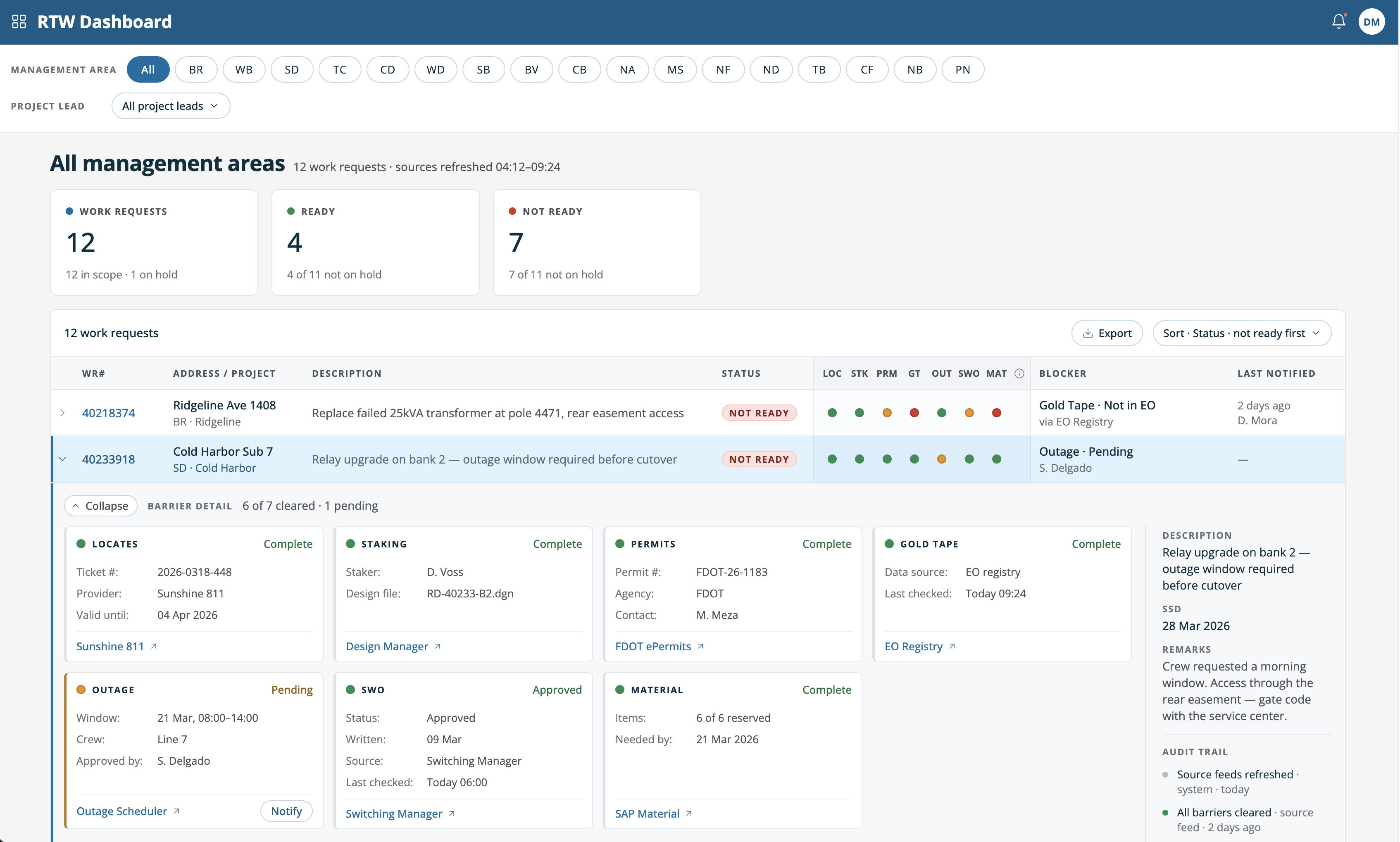
What the numbers claim and what the table shows now agree. Four ready and seven not ready against eleven, with one held aside. In the panel, three cleared, two pending and two blocked against seven dependencies.
Three counts that reconcile, the blocker and its owner on the row, and dependencies a manager can read without opening anything.
Seven dependencies in fixed order, each linking to the system that owns it. Notify appears only where there is a person to reach.
The second direction came back close to what shipped. The difference wasn't the tool. It was that the second attempt carried domain knowledge the first one couldn't have had.
The tool accelerated the making. It didn't decide what was worth making — that came from the interviews, and from knowing which patterns these teams already trust.